
THE 10 BEST WORLD CUP KITS - PART 2
THREADS OF THE WORLD: THE BEST WORLD CUP KITS (PART 2, #5–#1)
With the World Cup ending we still wanted to share the brilliance of some of the kits of this year’s tournament.
In Part 1 of our countdown, we broke down the brilliant storytelling and subtle textures of spots 10 through 6. Now, we are entering the heavy-hitter territory—the podium finishers that didn't just match the magnitude of the tournament, but completely redefined arena-ready style. These are the top five kits of the World Cup, plus a spectacular bonus that demands its own spotlight.
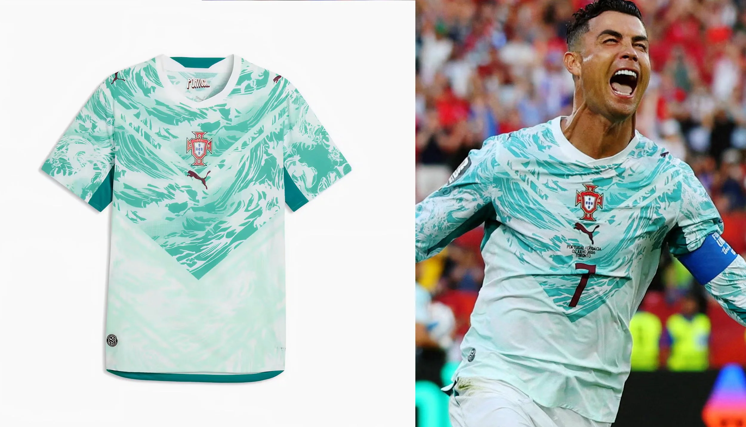
5. Portugal (Away) | Puma
Puma hits the top five with an away kit that completely ditches predictable road-white minimalism. Utilizing a highly sophisticated off-white palette mixed with deep, traditional tones, the visual balance here is immaculate. It strips away the clutter and relies heavily on premium tailoring and high-contrast badging to make an effortless, luxury-tier statement on the field.
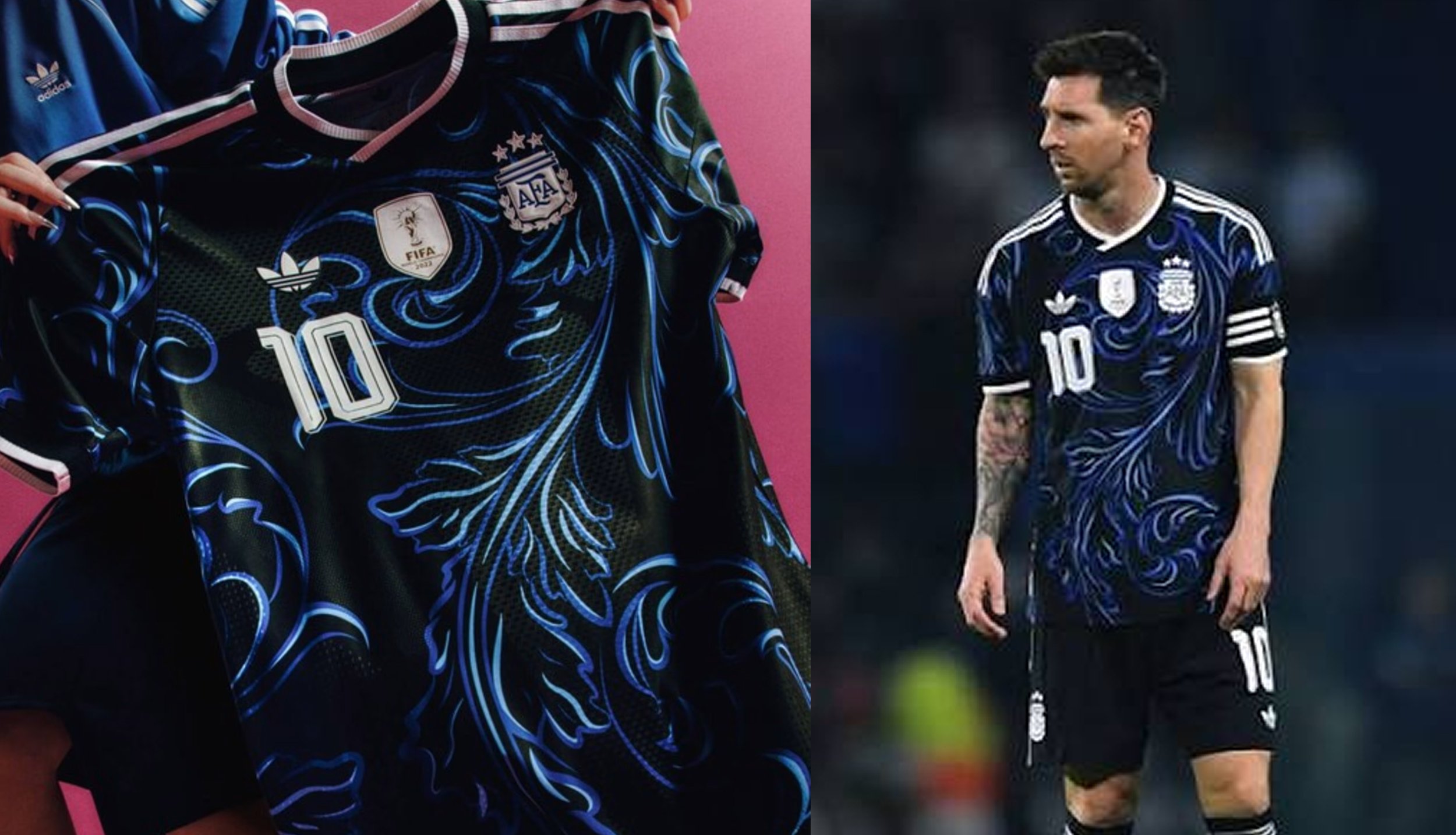
4. Argentina (Away) | Adidas
How do you reinvent a classic? You look to the night sky. Moving away from standard solid alternates, Argentina's away strip features an aggressive, deep blue tone accented by modern, radiating graphic hits. It feels both deeply rooted in the heavy pressure of La Albiceleste and thoroughly futuristic.
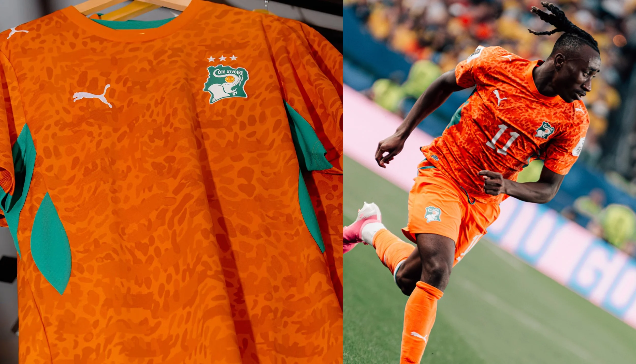
3. Côte d'Ivoire (Home) | Puma
Pure, unadulterated energy. Côte d’Ivoire’s home orange is incredibly difficult to execute without looking overwhelmingly loud, but this design nails it by anchoring the hue with crisp, structural detailing. The saturation is tuned perfectly for modern 4K broadcasts, making the players look physically imposing and instantly recognizable from the top row of the stadium.
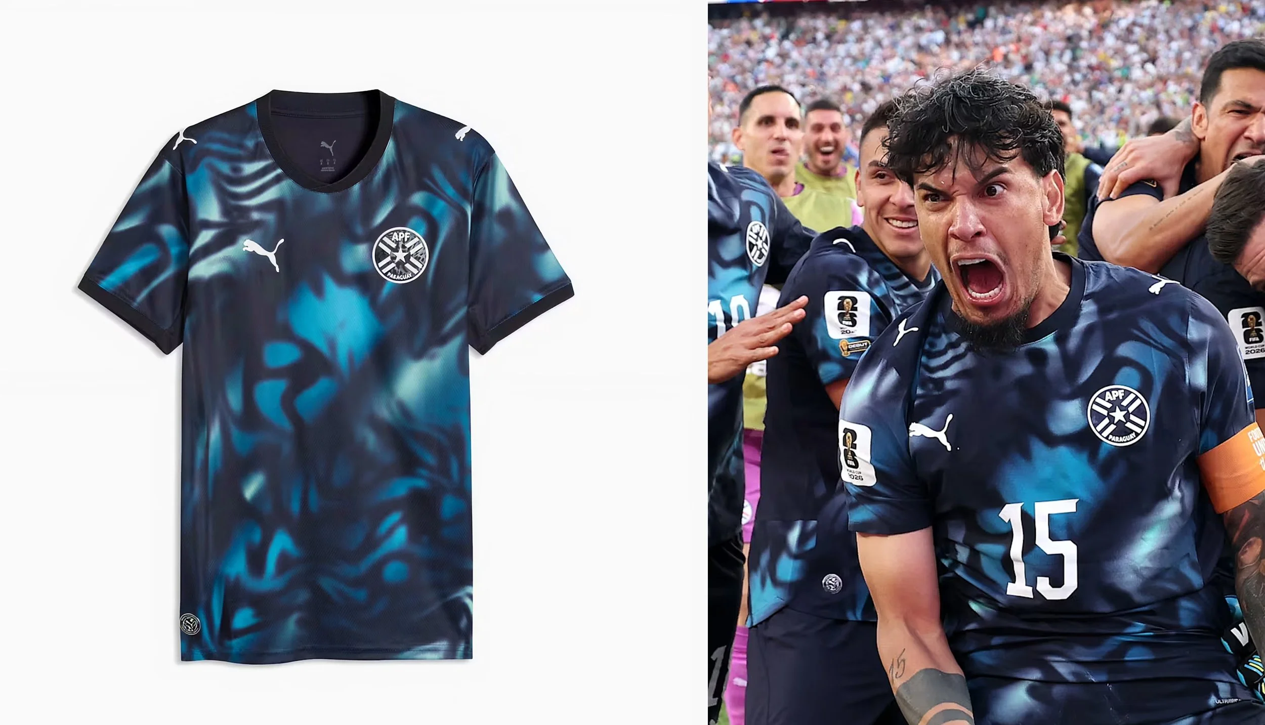
2. Paraguay (Away) | Puma
A stunning display of modern cultural translation. The Paraguay away kit utilizes a sleek, dark base that serves as a canvas for high-contrast, tropical blue accents. The linework reflects the diverse, dynamic culture within the nation's borders, resulting in a look that feels incredibly custom, premium, and instantly ready for both the pitch and lifestyle streetwear.
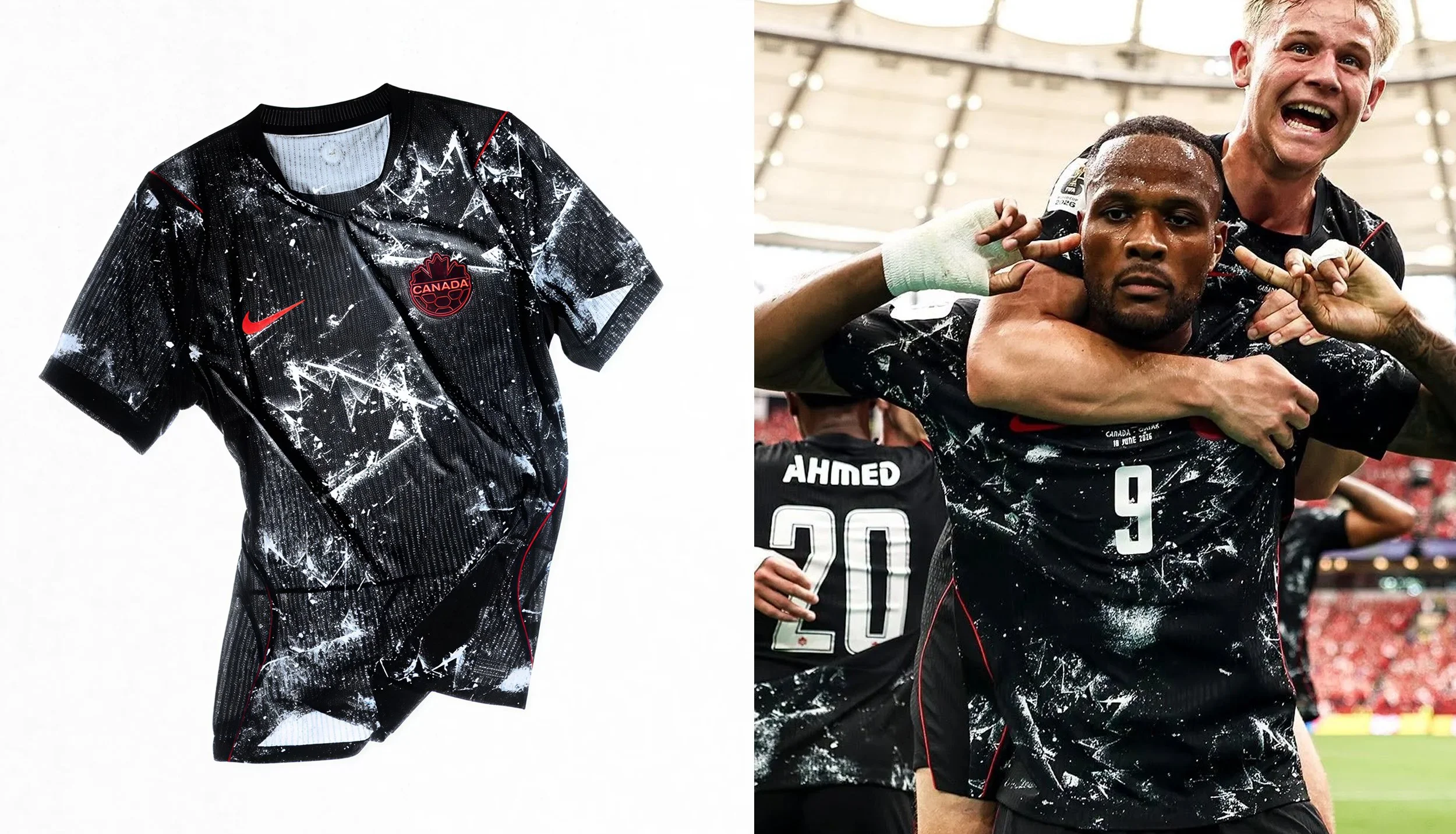
1. Canada (Away) | Nike
The undisputed champion of the tournament. Nike completely threw out the rulebook for the co-hosts and delivered an aggressive, ultra-modern masterclass.
Ditching standard color-blocking, this kit utilizes a stealthy black base completely overtaken by a chaotic, heavily distressed white graphic pattern. Up close, the shattered-ice effect masterfully carves out a highly stylized, abstract maple leaf. It’s brash, it’s loud, and it gives Canada a menacing, black-ice aesthetic that looks absolute full-tilt on the pitch. A flawless execution of sportswear-as-art.
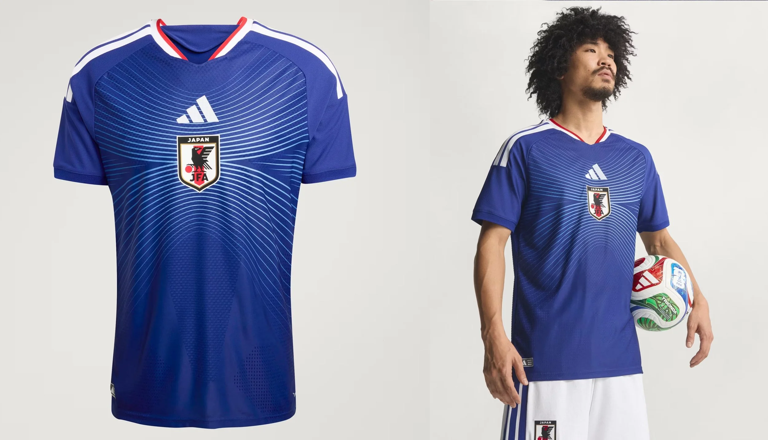
Bonus: Japan (Home) | Adidas
We couldn't close out the list without highlighting what Adidas cooked up for Japan. It is an absolute work of art that effortlessly bridges the gap between subculture and sport. Built on the "Horizon" design language, the classic Samurai Blue DNA is reinterpreted through a sleek, modern visual graphic across the center. The elegant white lines radiate outward from the centrally stacked federation crest and Adidas logo, mimicking a seamless skyline. It’s clean, highly technical, and perfectly embodies Japan's reputation for precise, boundary-pushing design.
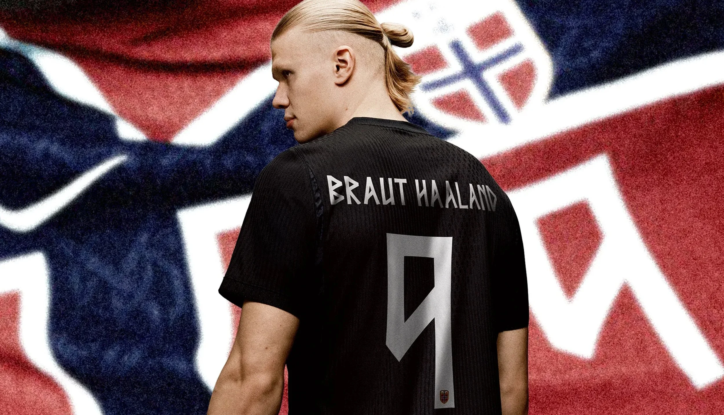
Bonus - Norway (Home/Away) | Nike
Norway delivers an absolute masterclass in typographic branding. While the home jersey leans into a stunning Nordic cross design, the true genius lies in the custom typeface designed for the names and numbers on the kits: Taakeferd Condensed ("Journey Through the Fog").
Nike and their design collaborators stripped away all standard curves, creating a geometric, razor-sharp, angular font system. To add dynamism to the straight lines, slight scalloping was engineered into the edges of each character. It transforms a standard piece of athletic teamwear into an elite, historic storytelling canvas that looks incredibly striking under modern stadium lights.
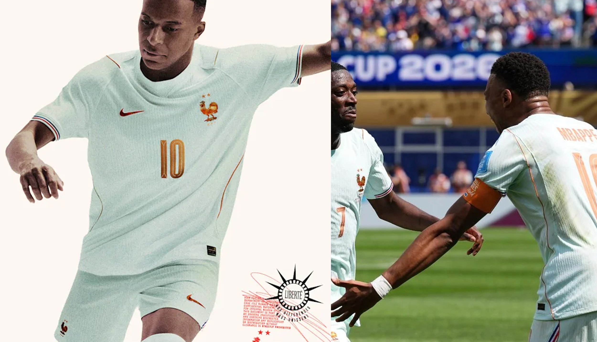
BONUS - France (Away) | Nike
Nike delivered a brilliant piece of historic storytelling with France's away kit, bridging French cultural heritage with the host nation's geography.
Stepping away from traditional stark white alternates, the jersey debuts a fresh oxidized mint green base paired with metallic copper crests and Swoosh badging. The color palette is a direct tribute to France's iconic 1886 gift to the United States—the Statue of Liberty—mirroring the natural transformation of raw copper into its signature patina green over time. Framed by subtle French tricolor trim on the sleeve cuffs, it stands out as one of Nike's most conceptually complete designs of the tournament.
By Jason Jay
CEO | Creative Director
Contender Studio