
Reimagining PWHL’s OTTAWA TEAM

As a female Canadian designer, having the opportunity to redesign the identity of a Canadian women’s sports team felt especially meaningful. Women’s sports in Canada continue to grow, and with that growth comes the opportunity to create brands that genuinely represent the communities they belong to. This project became more than a logo redesign; it was an exploration of identity, connection, and what it means to build a brand with the community at its centre.
The inspiration for this project came from the Ottawa Charge. While researching the existing identity, I learned that the original logo had been developed by an American-based design company. That discovery led me to ask an important question: What would a rebrand look like if it was designed through a local Canadian lens, with a stronger connection to the city and community it represents? As someone who understands the importance of women’s sports in Canada, I wanted to create an identity that felt rooted in Ottawa.
Understanding the Brand
Before sketching any concepts, I began by researching the Ottawa Charge and the meaning behind their existing identity. Understanding the current brand was essential before determining whether it should evolve or change entirely.

From there, our design team worked collaboratively through a CORE branding strategy exercise to better understand the organization, its audience, and the emotional impact the brand should create. We approached the process as if we were working directly with the Ottawa Charge organization to develop a complete rebrand.

Together, we explored questions such as:
How would the community describe us?
Who are our ideal supporters?
How do we sound to others?
How do people feel after interacting with our brand?
What tangible impact do we have on others?
What makes us radically different?
For each category, we generated as many ideas as possible before coming together to share our responses. As a team, we discussed each idea and voted on the strongest responses. This collaborative process helped us identify the values and emotions that best represented the organization.
The next stage involved creating customer profiles. Together, we developed three potential audience demographics and explored their backgrounds, needs, motivations, and how the brand could provide value to them. These profiles ensured that every design decision was grounded in real user perspectives rather than assumptions.
Building the Vision

With the insights gathered from our branding strategy sessions, our design team began exploring visual directions through moodboards. Each team member developed their own moodboard, then presented it. Sharing our work allowed us to compare different interpretations, exchange feedback, and identify recurring themes that best represented the identity we were trying to create.
Rather than focusing on designing a logo, the moodboards were used to establish the overall visual direction of the rebrand. They helped define the brand's personality, tone, and emotional feel while providing a strong creative foundation for the concept development stage.
During this phase, another major question emerged: should the team remain the Ottawa Charge, or should it adopt an entirely new identity?
This led to the exploration of a potential rebrand: the Ottawa Osprey.
Both directions had strong potential, so we began concept development for each.
For the Ottawa Charge, we explored what a mascot could look like, since the team currently does not have one. We explored the Osprey as an identity, inspired by its athleticism, speed, and connection to the natural environment.
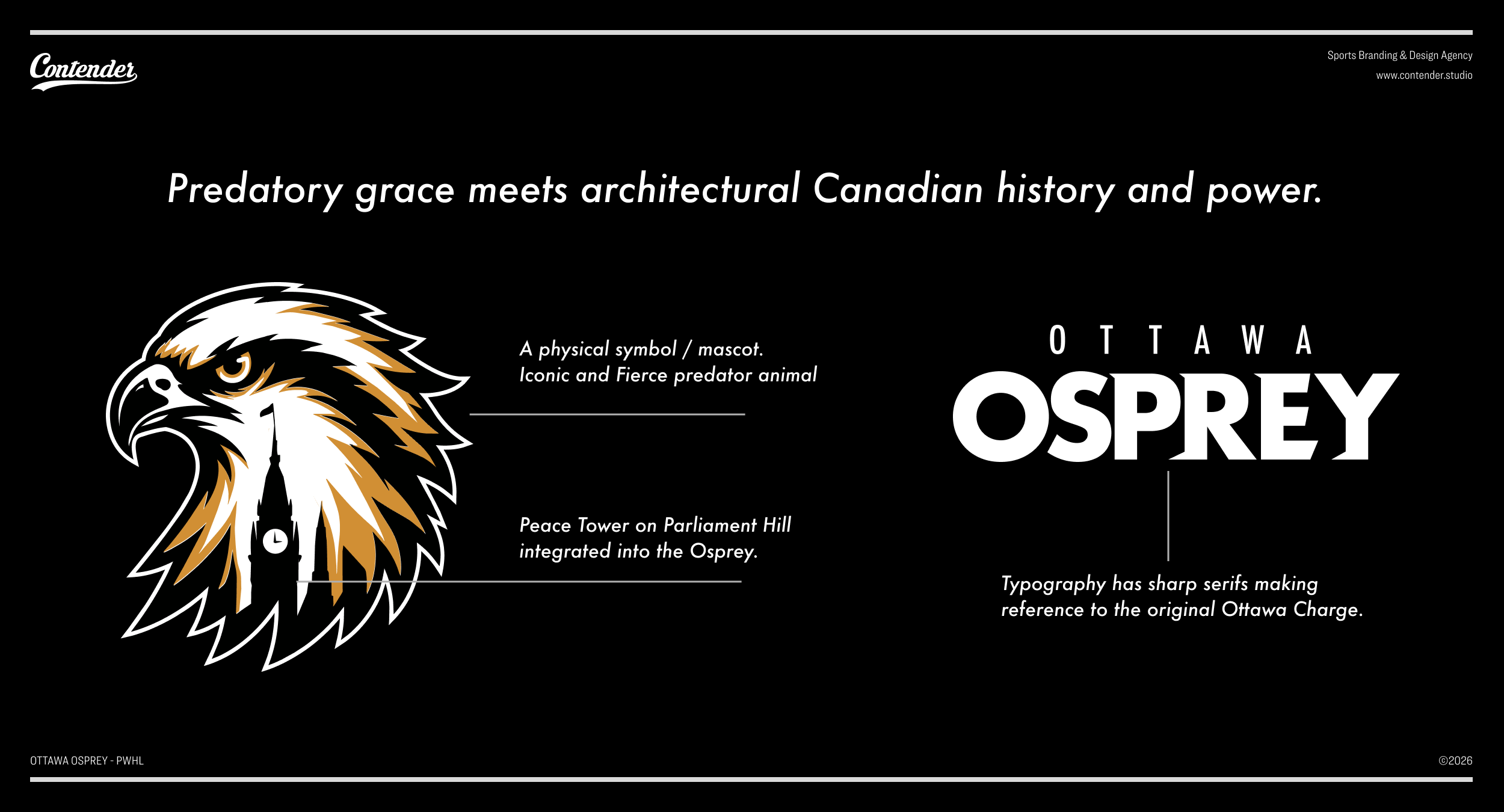
We explored ways of incorporating the Peace Tower on Parliament Hill into the logo, along with elements of the Ottawa skyline. Rather than simply placing recognizable landmarks into the design, we wanted them to feel like a natural part of the identity itself. The Peace Tower is one of Ottawa's most iconic landmarks and serves as an instantly recognizable symbol of the city. By thoughtfully integrating it into the logo, we aimed to strengthen the connection between the team and the community it represents.
I collected reference images of the Osprey in various poses and studied existing sports logos featuring similar subjects. The Osprey offered opportunities for dynamic forms, symbolism, and storytelling while allowing the identity to embrace both the city and the landscape that surrounds it.
Typography and Iteration

Once multiple logo concepts had been developed, we shifted our attention to typography.
We explored a wide range of typefaces, building a collection of options that could potentially fit the brand. As we refined the selections, we narrowed the choices to a small group of strong contenders. From there, we experimented with kerning, contrast, sizing, and layout to determine which typeface best complemented the identity. Eventually, a few standout options emerged, allowing us to compare them alongside the logo concepts before selecting the final direction.
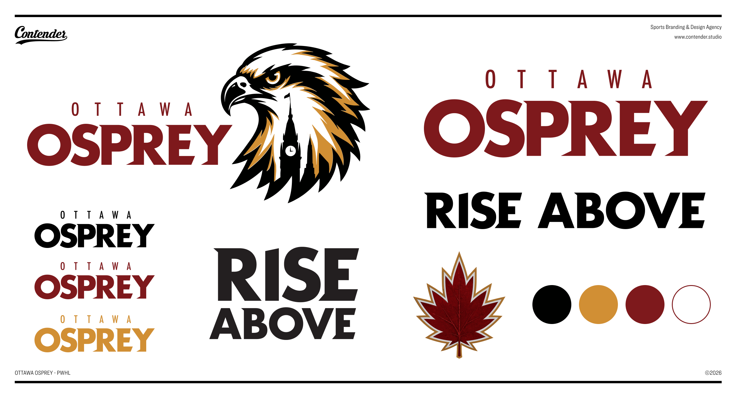
After selecting the strongest concept, we refined the design in Adobe Illustrator by improving the vectors, adjusting proportions, and simplifying forms to create a cleaner, stronger logo.
We continued refining the logo through multiple iterations, simplifying forms, adjusting proportions, and adding stylized details. At one point, we experimented with incorporating a stylized maple leaf directly within the osprey. While the element itself was successful, we ultimately determined that it made the logo feel too busy. Rather than removing it entirely, we repurposed the maple leaf as a secondary graphic element across the broader visual system, particularly in jersey designs.

Creating a Complete Brand System

Once the logo and typography were finalized, we began exploring colour.
I researched the official colour palettes of the Ottawa Charge, Ottawa Senators, Ottawa 67's, and Ottawa Redblacks. By identifying the exact HEX values used across these organizations, I discovered a consistent visual language within Ottawa sports branding. This research informed the final colour palette and ensured that the identity still felt connected to the city's existing sports culture while establishing its own personality.

With the core identity complete, the project expanded into a full brand system.
We designed:
Jerseys
T-shirts
Hats
Scarves
Hockey pucks
Centre ice graphics
A goalie mask
Creating these applications allowed us to see how the identity functioned beyond the logo itself. A successful sports brand must work across merchandise, uniforms, digital media, and fan experiences, not just in a single mark.

Using AI as a Design Accelerator
To fully visualize the rebrand, I incorporated AI into my workflow as a design accelerator rather than a primary design tool.
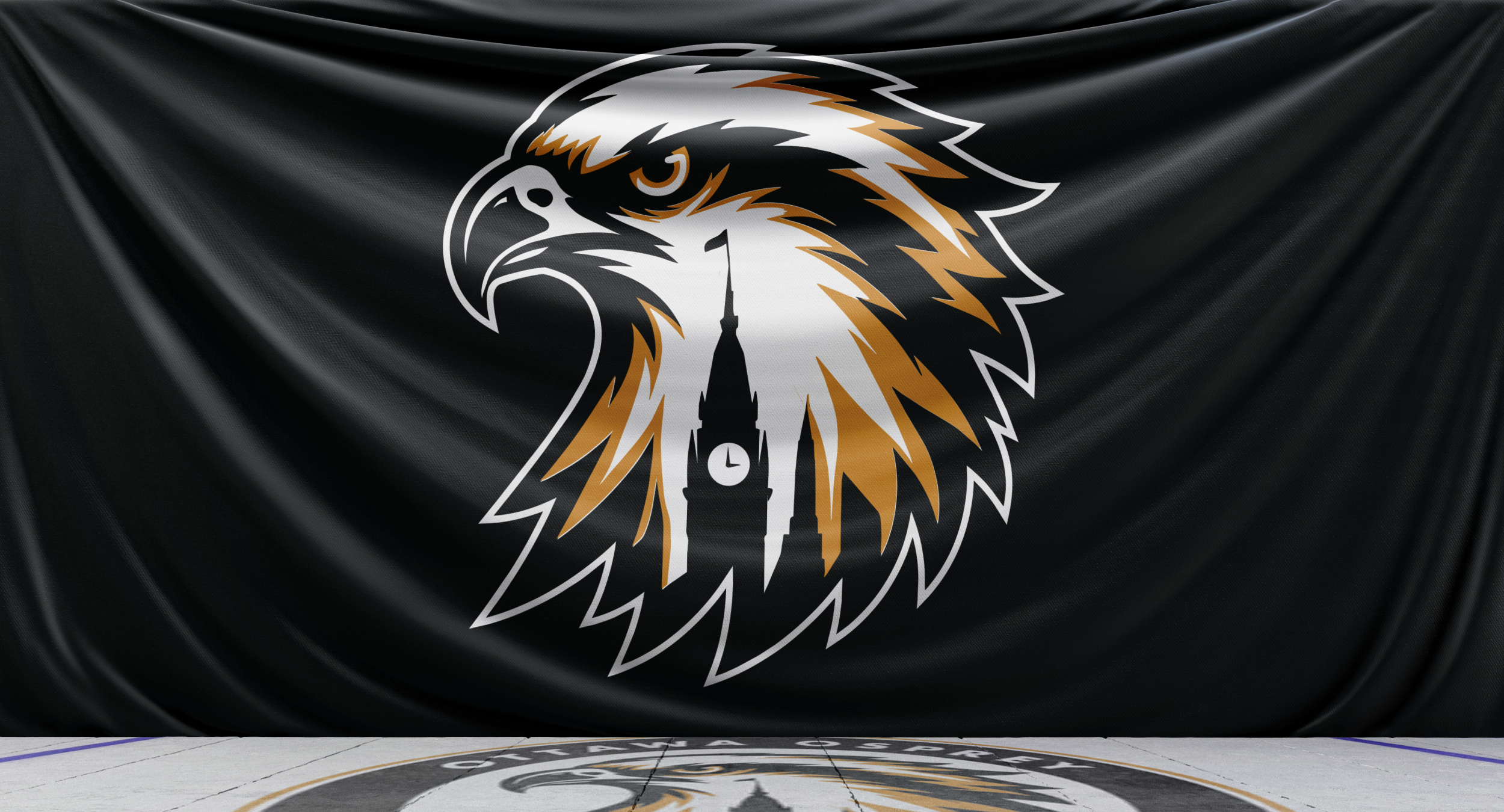
The branding strategy, research, moodboarding, concept development, typography, and visual identity were all created collaboratively by our design team through a human-centred design process. AI did not generate the ideas or make creative decisions. Instead, it accelerated the visualization stage, allowing us to bring our concepts to life faster and communicate the final vision more effectively.
Using photographs of Ottawa Charge players found online, I used AI image editing tools to replace the existing uniforms with the newly designed Ottawa Osprey jerseys. This allowed me to quickly visualize the identity in realistic game situations and evaluate how the branding performed beyond static mockups.
We also used these updated player images to create social media graphics for game days, final scores, wins, and player signings. By accelerating the production of realistic visuals, AI helped communicate the final concepts while ensuring that the strategy, branding, and creative direction remained entirely driven by our team's ideas and design process.
Final Thoughts

This project reinforced that great branding does not start with a logo. It starts with understanding people and embracing collaboration.
Through research, strategy, collaboration, community exploration, audience profiling, concept development, typography, and countless iterations, the final identity became more than a visual exercise. It became an opportunity to imagine what a women's sports brand could look like when designed through a Canadian perspective with a deep connection to Ottawa, its landmarks, its natural landscape, its community, and the athletes who represent it.
.
.
.
Olivia Weiss
Design Intern
Contender Studio