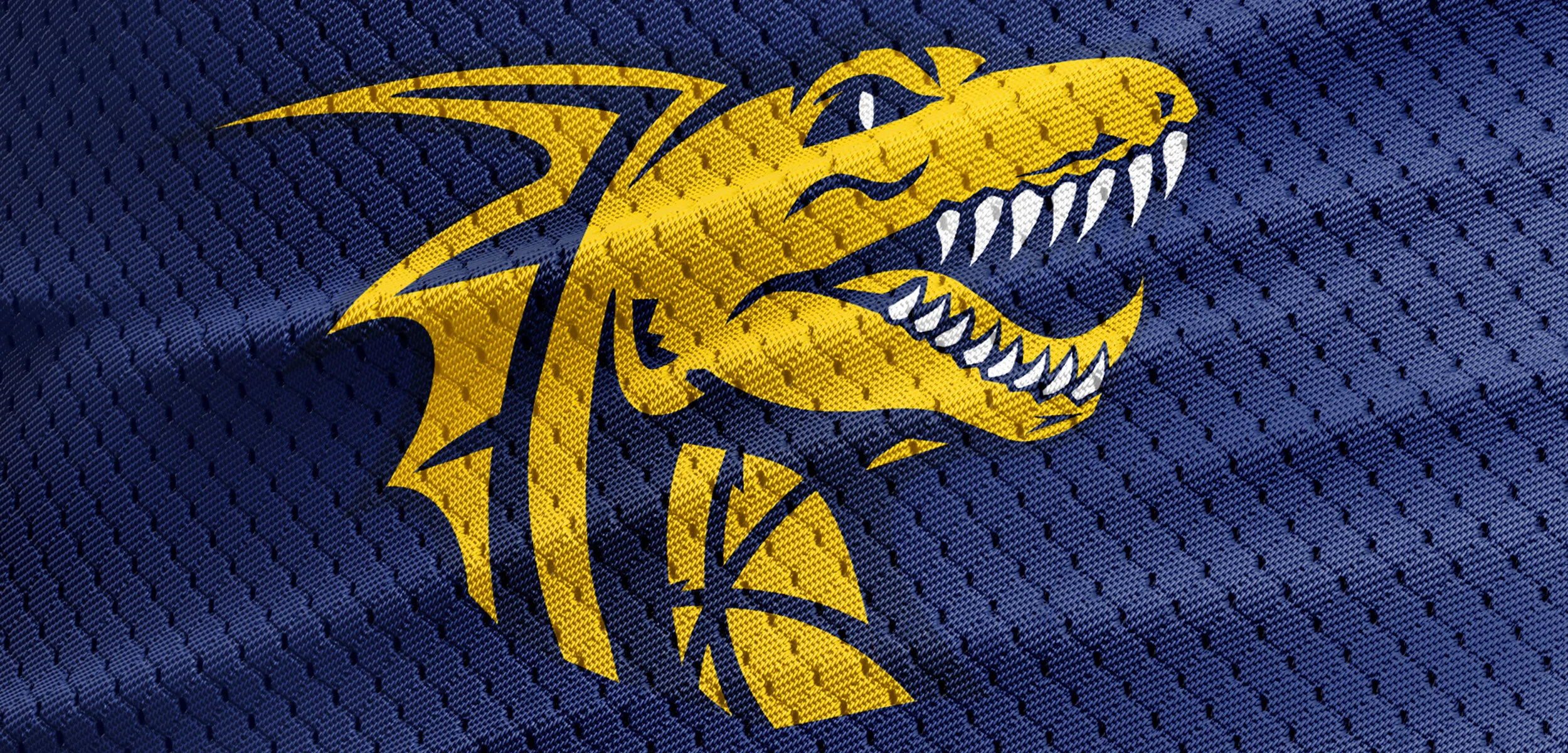
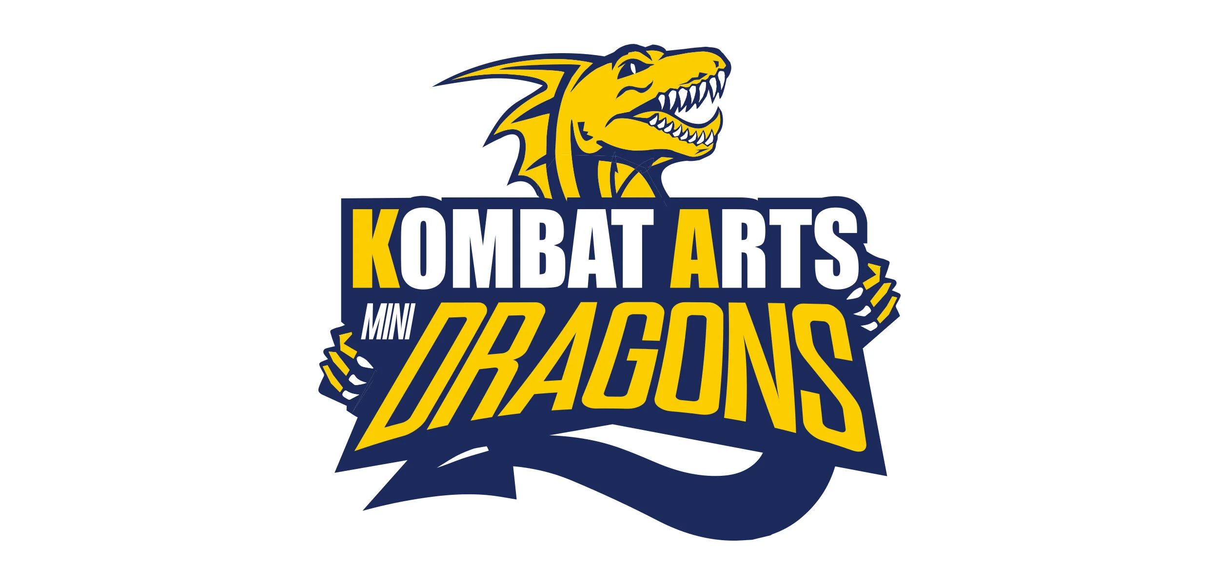
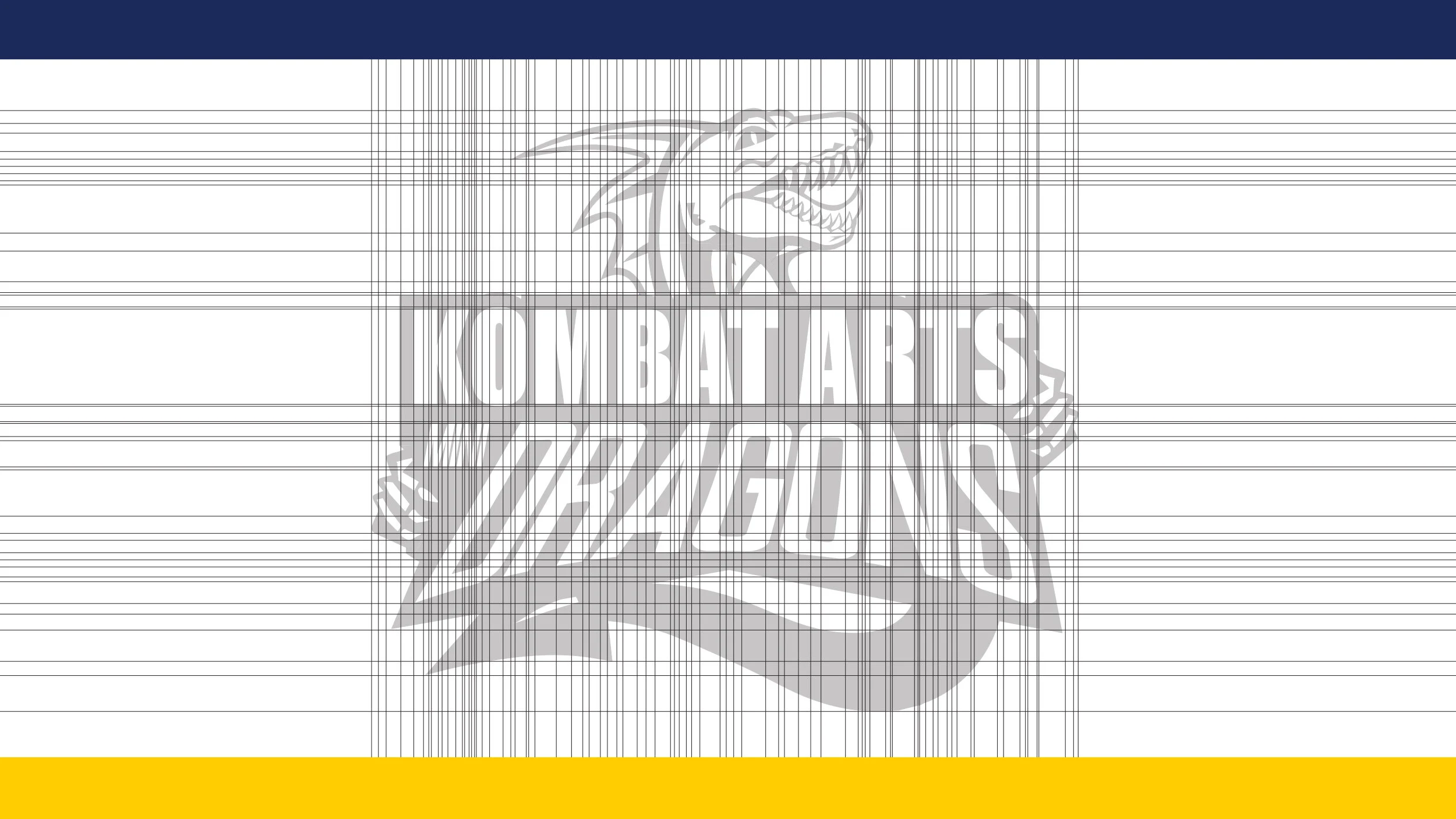
MINI DRAGONS REDESIGN - SPORTS BRANDING
Overview
Kombat Arts approached us to create a brand identity for their Mini Dragons program, a foundational martial arts class designed to introduce young children to discipline, confidence, and fun through movement. The goal was to capture the energy of martial arts while keeping it approachable and exciting for kids and parents alike.
Approach
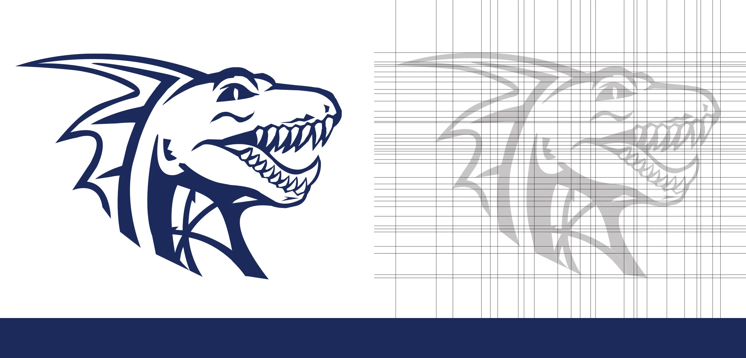
We developed a playful yet strong visual identity centered around a custom dragon mascot. The branding balanced bold shapes and vibrant colors to engage children, while maintaining a professional polish aligned with Kombat Arts’ established reputation in the martial arts community.
Deliverables
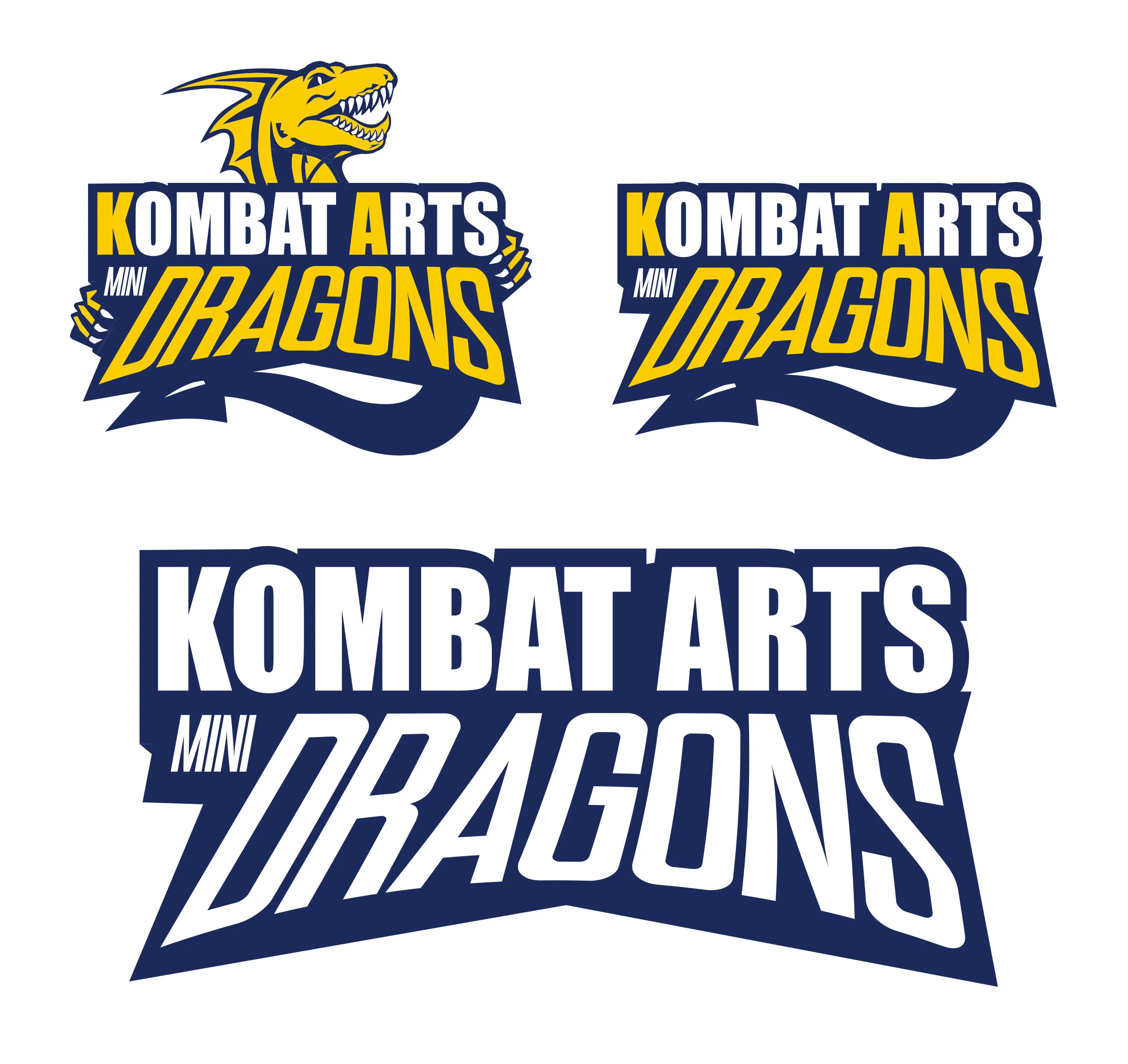
Logo design featuring the Mini Dragons mascot
Color palette and typography system
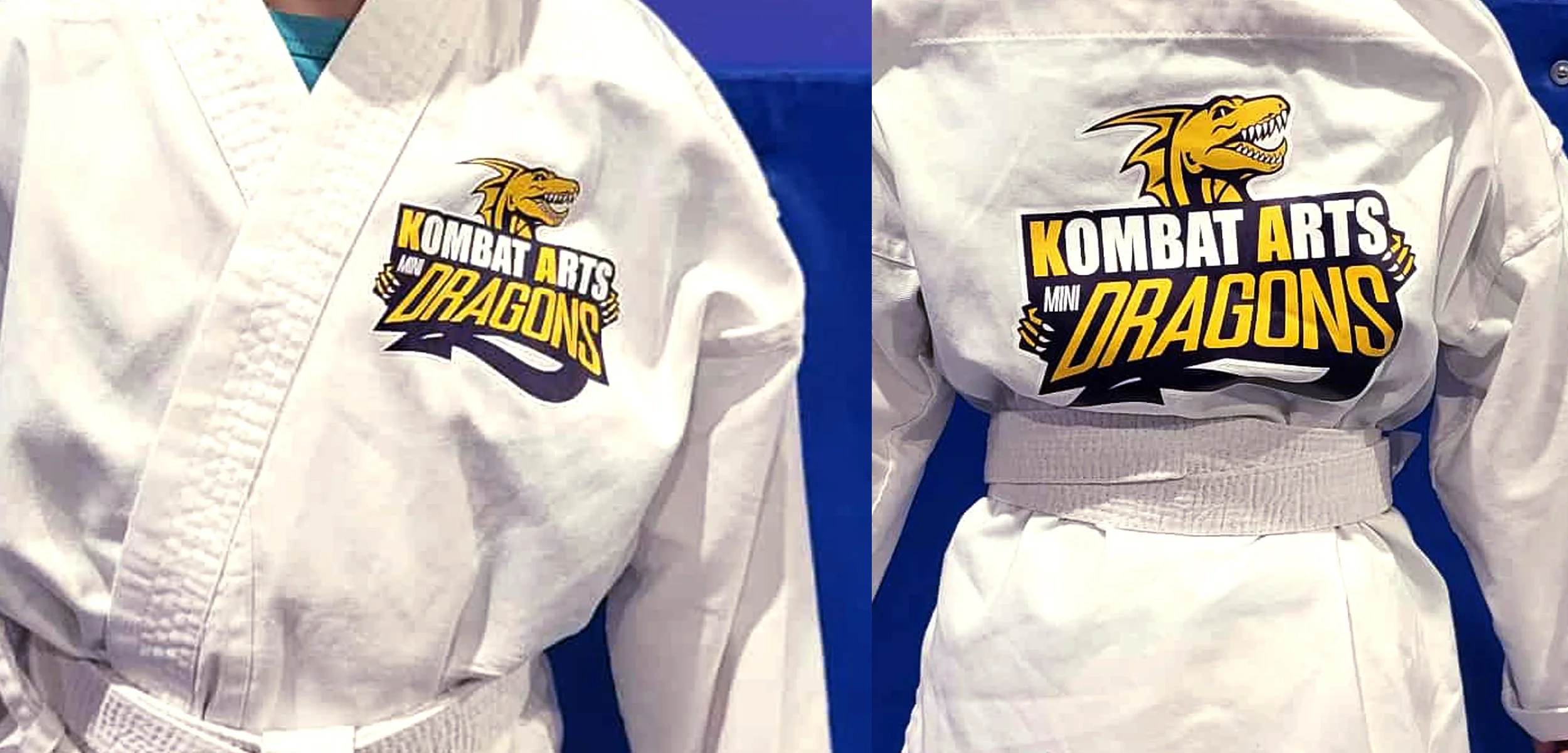
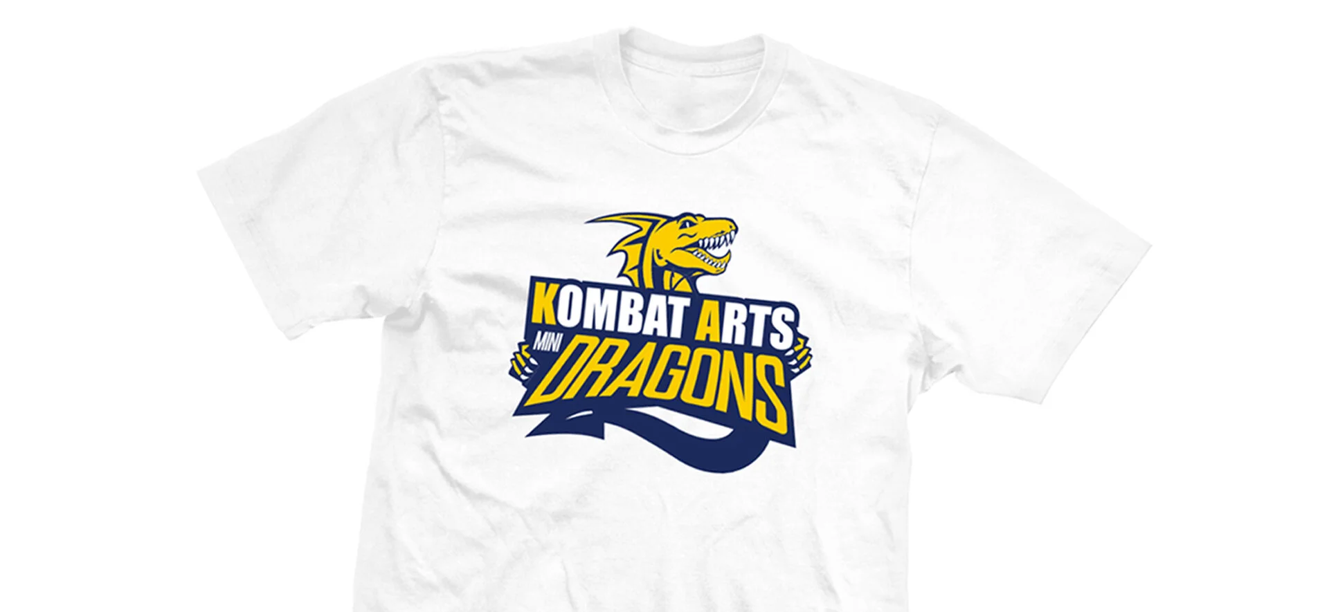
Branded uniforms and badges for students
Marketing collateral (flyers, social media graphics, and posters)
Impact
The new Mini Dragons identity created a sense of pride and belonging for young students while giving parents confidence in the program’s quality. The cohesive branding helped Kombat Arts differentiate the program, increase visibility, and attract new families to the academy.
CLIENT: KOMBAT ARTS | MINI DRAGONS
ROLE: CREATIVE DIRECTOR / DESIGNER
SCOPE OF PROJECT:
Branding
Logo/Identity Design
Brand Strategy
Apparel / Uniform Design
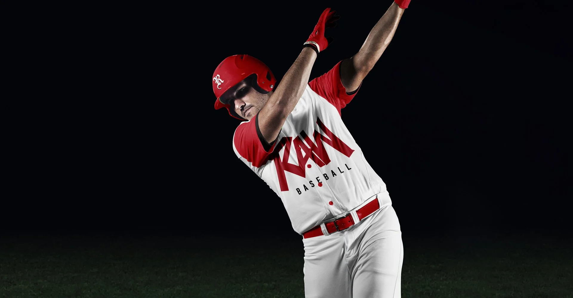
RAW BASEBALL
Overview
Ryan Asis, a performance coach and athlete developer, launched RAW Baseball to provide elite training, mentorship, and skill development for aspiring baseball players. He needed a brand identity that reflected his philosophy—real, authentic, and work-driven—while appealing to both young athletes and their parents.
Approach
We designed a bold, modern identity anchored in strength and movement. The RAW wordmark uses sharp edges and dynamic typography to convey intensity, while the supporting design system incorporates clean lines and a minimal color palette to highlight professionalism. The branding draws from baseball’s heritage but positions RAW Baseball as a forward-thinking, athlete-first program.
Deliverables
Primary and secondary logo suite
Custom typography treatment for “RAW”
Color palette and brand guidelines
Branded apparel and training gear applications
Social media templates and marketing graphics
Impact
The new brand identity gave RAW Baseball a powerful and credible presence, setting it apart from traditional training programs. Athletes and parents connected with the strong, authentic message, helping establish Ryan Asis as a trusted leader in baseball development.
CLIENT: RAW BASEBALL - RYAN ASIS
ROLE: CREATIVE DIRECTOR / DESIGNER
SCOPE OF PROJECT:
Branding
Logo/Identity Design
Brand Strategy
Apparel / Uniform Design


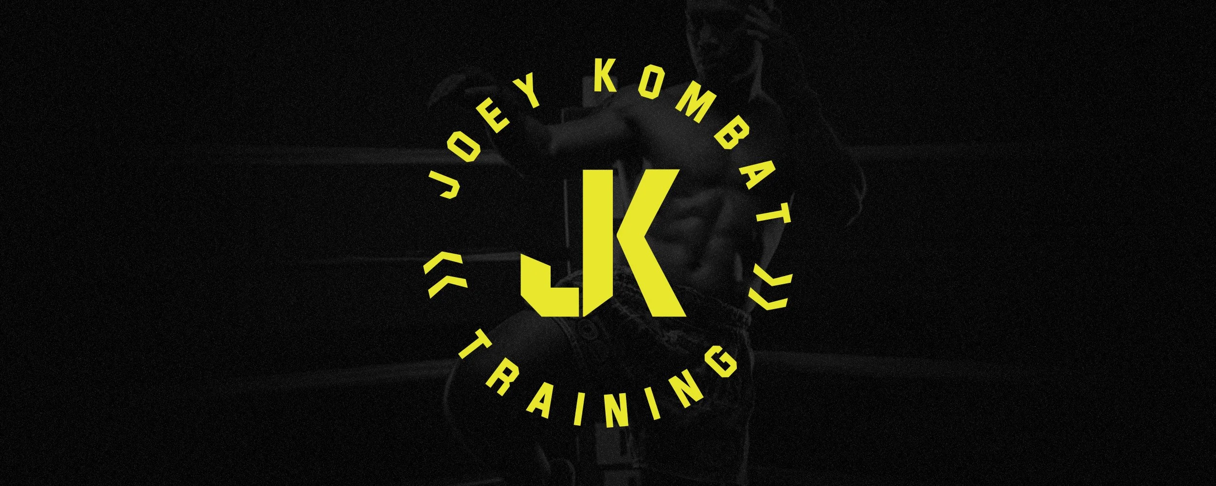
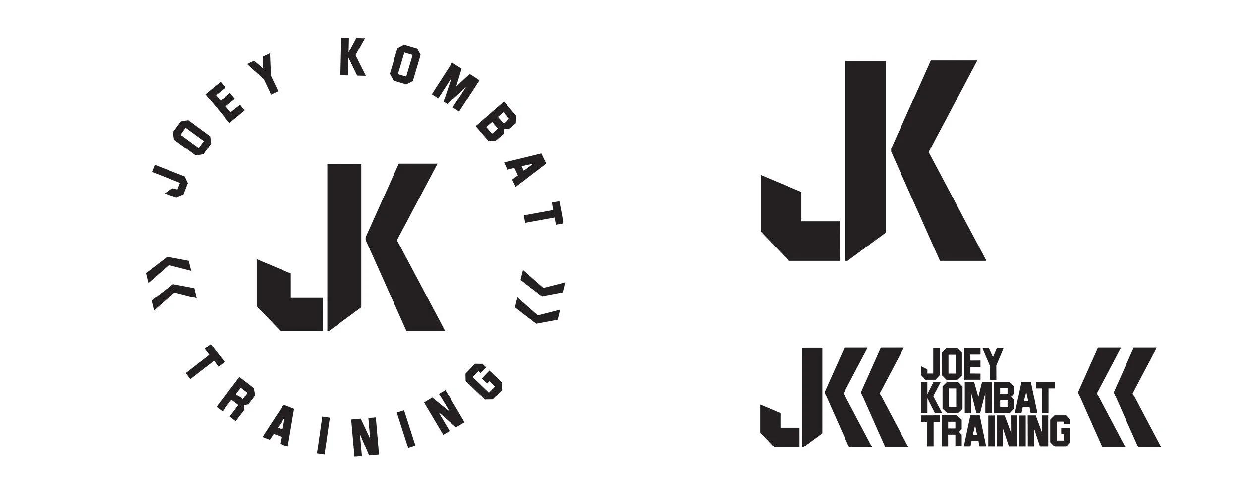
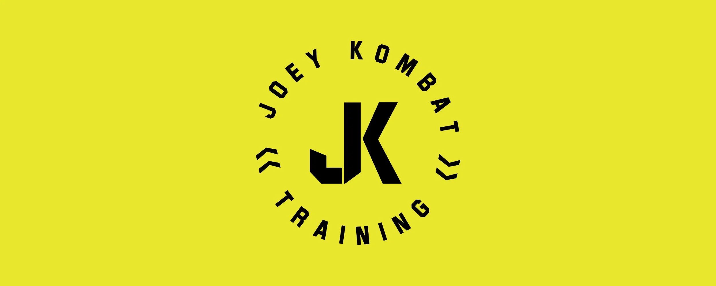
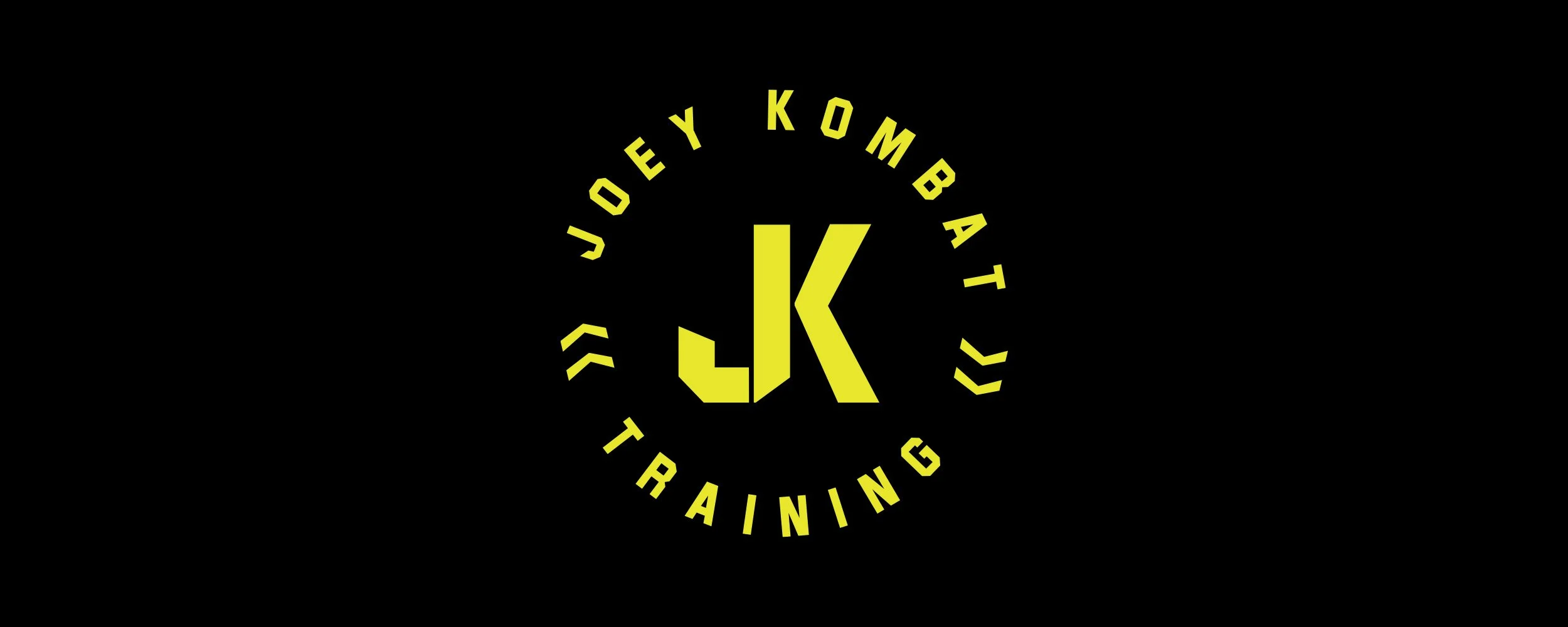
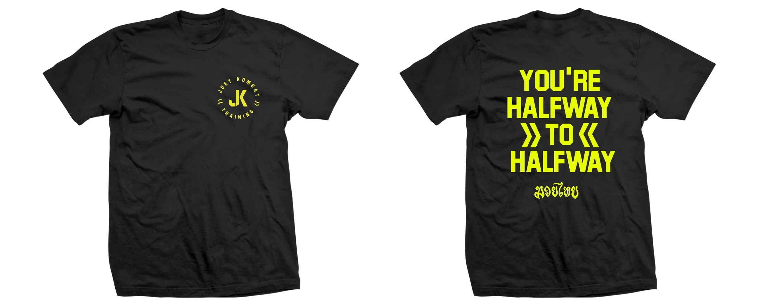
JOEY KOMBAT | FITNESS BRAND
Overview
Joey De Los Reyes, co-founder of Kombat Arts Training Academy and a respected martial artist, wanted to build his personal brand—Joey Kombat—as a platform to share his expertise, training philosophies, and martial arts lifestyle. The challenge was to create a brand identity that reflected Joey’s deep experience and authenticity, while remaining modern and versatile for digital platforms.
Approach
We crafted a bold identity inspired by Joey’s martial arts legacy and personal character. The logo combines strength and fluidity, balancing sharp edges with dynamic form to reflect discipline and adaptability. The brand system uses a strong monochrome palette with accent colors, ensuring flexibility across social media, merchandise, and promotional material.
Deliverables
Logo and identity design
Color palette and typography system
Social media branding and templates
Branded merchandise applications
Impact
The Joey Kombat brand gave Joey De Los Reyes a strong, professional presence beyond the gym. It provided a recognizable and adaptable identity that connects with students, peers, and the broader martial arts community, supporting his growth as both a coach and personal brand.
CLIENT: Joey De Los Reyes
ROLE: STRATEGY, BRAND STRATEGY, DESIGN, ART DIRECTION

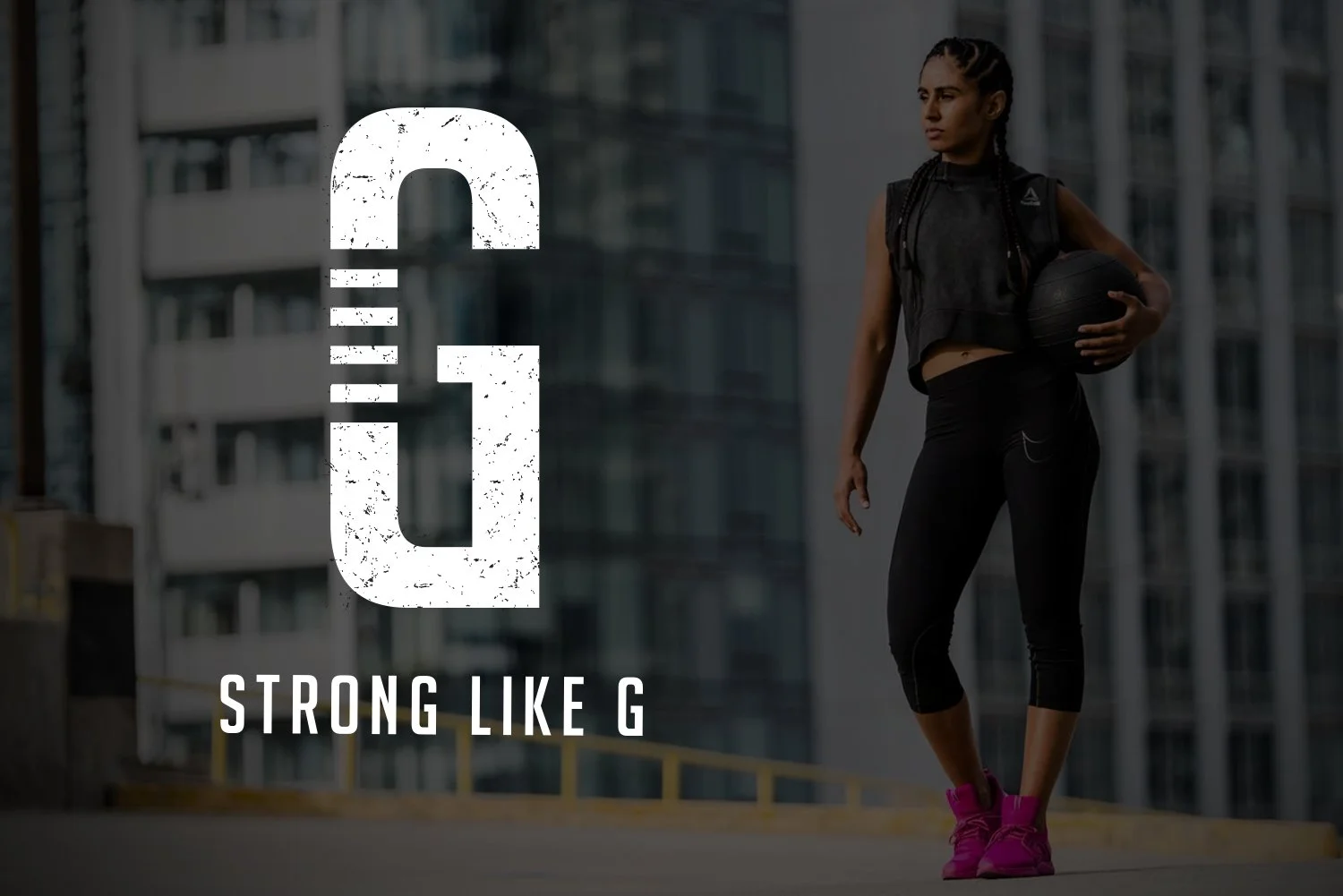
STRONG LIKE G
Overview
Strong Like G is the personal brand of trainer Gursharn Gill. The goal was to create a distinct identity system that reflects her empowering approach to fitness and resonates with potential clients seeking strength, confidence, and personal transformation.
Approach
Following the Contender Studio process, we defined the brand strategy, identified target users, and built an identity system that balances approachability with strength. The visuals incorporate bold typography and energetic design elements to capture Gursharn’s dynamic coaching style while staying authentic to her personality.
Deliverables
Brand strategy and positioning
Logo and identity system
Color palette and typography
Social media graphics and templates
Branded apparel applications
Impact
The Strong Like G brand gave Gursharn Gill a professional, cohesive presence in the fitness space. It allowed her to confidently connect with clients, communicate her values, and grow her personal training business with a strong foundation for future expansion.
CLIENT: STRONG LIKE G / GURSHARN GILL
ROLE: BRAND STRATEGY, DESIGN, ART DIRECTION, IDENTITY / LOGO DESIGN.,